SaaS
B2B
eCommerce Management
Simplifying daily tasks for 5,000+ store managers
Project results
User Satisfaction increased from
3.5 to 4.1
Customer Effort Score improved from
4.6 to 5.8/7
Adoption Rate boosted by
523%
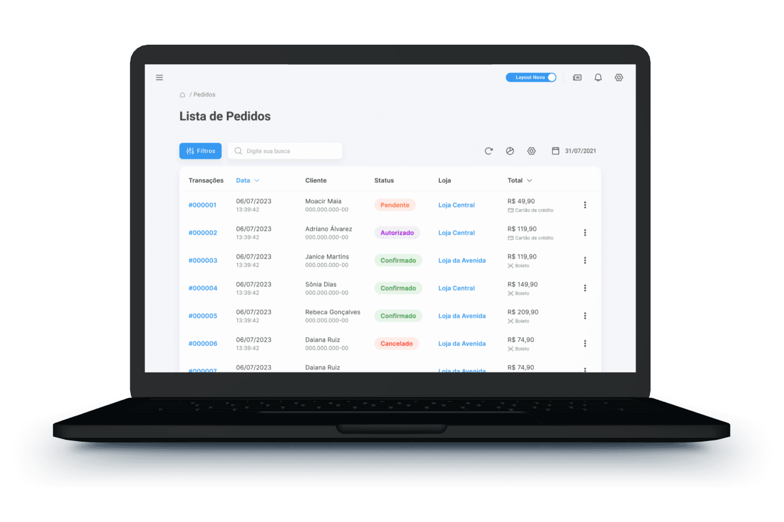
Tray Corp, a leading Brazilian eCommerce company, faced usability challenges with its heavily trafficked Orders page, representing 55% of weekly visits. Users reported issues, prompting a redesign initiative.
Research
The first step I took was to collect metrics to identify the main areas for improvement. During this process, I also gathered heatmaps and screen recordings, which helped to identify various user pain points.
In-depth methods
Interviews
Satisfaction assessments
Surveys
Heatmaps
Session recordings
Usability analysis
Issues identified
User dissatisfaction
Effort-intensive order filtering
High abandonment rate
Feature location difficulty
Misaligned page structure
Structural Problems
Financial data exposure, information overload, unclear hierarchy.
To gain a deeper understanding of the issues, I conducted several interviews with store managers.
This allowed me to organize the key problems and present them to the team. Consequently, we were able to define which metrics could be improved through the redesign.
Objective
Enhance user satisfaction, reduce effort, and address high page abandonment.
Strategy
Then, I began sketching possible proposals. Using Figma, I created several quick prototypes and validated with the developers which proposals could be implemented.
In addition, I conducted several usability tests, both qualitative and quantitative. These tests were extremely rich in content and led to various adjustments that ultimately refined the interface and adapted it to the users' daily needs.
Goals
Reduce cognitive load, increase productivity, enhance personalization, empower users.
Proposal
Simplify by reorganizing hierarchy, introducing a user-friendly date picker, quick action button, and a concise "resume" feature.

Usability Tests
Qualitative Tests
5
Individual meetings
10
Identified problems
Quantitative Tests
78
Testers using Maze
+5
Identified problems
Final Adjustments
After several rounds of interface refinement, I achieved a highly satisfactory result with good indicators of user day-to-day adherence. Then, I proceeded to finalize the interface and handoff to the developers.
The development process took several months. I actively participated, providing support to the team and answering any questions that arose. At the end of each delivery, I applied the UI review process to ensure quality and fidelity to the prototype.

Results
User Satisfaction increased from
3.5 to 4.1
Customer Effort Score improved from
4.6 to 5.8/7
Adoption Rate boosted by